Drop us a note
Trusting your business with us is a smart idea and you know it. Ask us any question you might have, and we will get back to you as soon as possible.
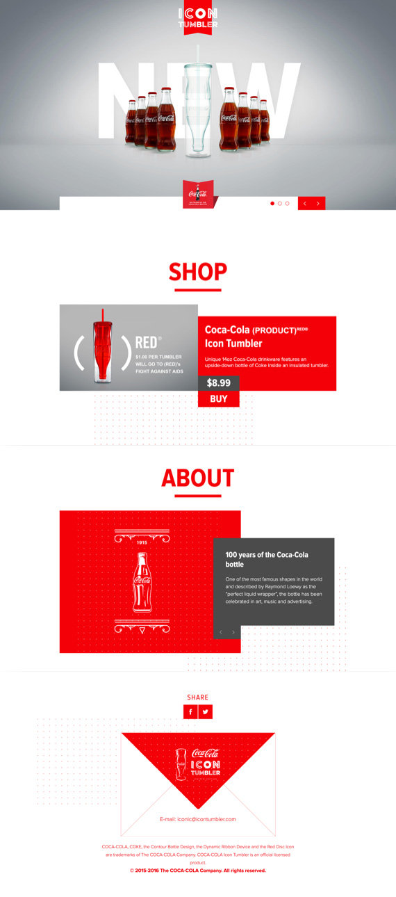
Not so long ago, Coca Cola hired us to design and develop a beautiful page dedicated to their new bottle celebrating the 100th year of perfection and inspiration to a Worldwide brands.
A quick History class for those who did not know, Coca Cola first bottled in 1899, a medicine looking bottle with metal stopper. Few years after, in 1915 to be precise, Coca Cola launched their famous bottle that is in use up to date. Inspiration was found in perfect women shape and brand wanted to be recognized by it, which we can all agree they managed to succeed. With a century of use, and a Worldwide recognition, Coca Cola made it up even in the space, as the first drink ever to be drunk outside of the Earth’s Atmosphere.
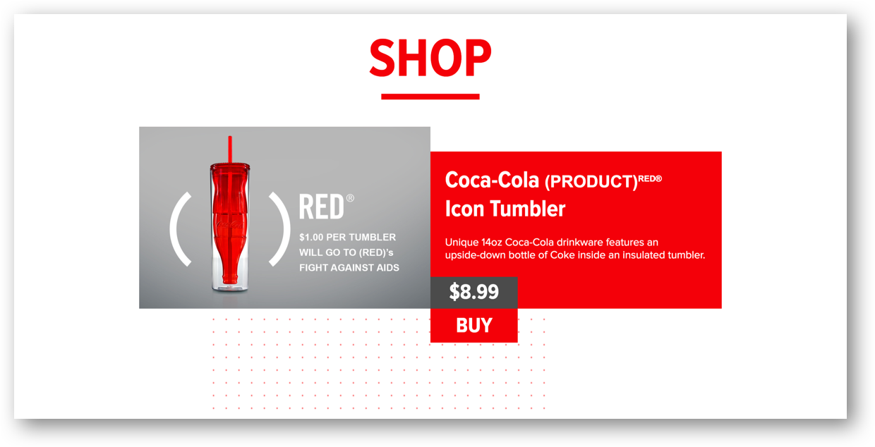
But the brand never stopped there. In 2011 they announced a joined partnership with nonprofit organization RED supporting fight against AIDS. Together, in 2015, they celebrated a century of Coca Cola’s bottle with the Iconic Tumbler, that could be bought straight from the Amazon, and from each sale a significant donation would be streamlined to fight against AIDS. What a wonderful story, and what a great honor to be part of this.
CHALLENGE
Create a page worthy of Brands such as Coca Cola and RED organization, optimize it for increased sales and honor the brands authority that has been present for more than a century.
OUTCOME
Just like Coca Cola made a bottle 100 years ago that can be recognized even in the dark, we made a page that, with no doubt, everybody could connect with on a first look. Fully optimized page, built to inspire and spread the awareness of brands mission to support the fight against AIDS. Honored the century of Brand’s success, and raised the bar for 100 years to come.
SHARE THIS
Facebook / LinkedIn
SCOPE OF PROJECT
Strategy Definition
Web Design - UX and UI
Development
Quality Assurance
SEE THE WEBSITEThe true challenge was: “how to make it unique in a couple of days, when a brand has been unique for more than a century?” When you work with partners such as Coca Cola, there is no space for ordinary. You need to push the limits above the breaking point, breaking the design and reassembling it over and over until you get it done.
And it’s not just about the outstanding design, it also had to be conversion oriented for driving sales and promoting a humble cause - fight against the AIDS.
To sum it up, we were given a task with a 3 big challenges:
Every page that we design has it’s story. The only difference now was that the story we needed to tell is a century long, and we needed to fit it in a single slider. Not an easy task for any design team.
The solution that is now present on the website had to go through countless design reviews, but the best part is - we love it!
Just as every design starts, this one also started with the sketching and wireframing. The golden colors of the UX, the magnificent black and distinguished white, where in constant interfering with each other, until we reached the “good enough”. Of course, there is no such thing as good enough, especially when you work with brands like Coca Cola, but we knew that if we keep going we can easily end up in nonlinear game, where only rule is that there are no rules.
It was clear enough that UX phase needed some life added to it. The UI phase started with adding the famous #F40000 - for those who did not know, that is a code name for the color of your childhood, the Coca Cola red color.
The design started looking more and more beautiful, and just like that, we made something special, but most importantly we accomplished the first challenge!
The second challenge was easy to accomplish once we managed to incorporate the Coca Cola’s brand identity into the page, as the RED is always...red.
The storytelling truly won the race here, as the copy had to be emotional and appealing to majority of people. According to UNAIDS, 1 million people died from the virus in 2016, with a total number of 35 million people who died since the start of the epidemic. The numbers unfortunately speak for themselves, and we needed to bridge down the connection between Coca Cola and their support in fighting against global virus.
The message had to be powerful, but it had to be spoken without any words, as that’s the way Coca Cola deals with it - simple and minimalistic, yet emotional and inspiring.
We managed to accomplish the #2 challenge by adding innovative visuals and animations, highlighting what was important and showing people that Coca Cola cares.
 Emphasizing the Sale Aspect of the Website
And the most difficult part to accomplish was to avoid stones people were prepared to throw at you once they saw that you were trying to sell a product by sticking to a cause which was emotional and powerful such as this was.
The problem that public doesn't understand is that it’s impossible to raise the money, unless you have the people willing to buy the product, and to accomplish that you need to promote it by explaining what the product is supporting.
We managed to achieve this, not just in design, but also in optimizing the “on page” as well as off page conversions dealing with the Amazon Advertising.

“How to make the website unique in a couple of days, when a brand has been unique for more than a century?”
No doubt this was one of the projects that will always be close to our hearts. To be a part of such a cause, and to work with brands such as Coca Cola and RED organization, is truly an amazing experience.
We helped Coca Cola in their mission towards an AIDS free world, and we are looking forward to new and exciting projects with similar and powerful missions.
If you are on a mission to change the world, feel free to contact us, and we can do it together.